This vignette is intended for analysts that are interested in
learning how to visualize SomaScan data with the SomaPlotr
R package. SomaPlotr contains numerous plotting functions
that are specifically designed to identify and display patterns in
SomaScan data. These functions provide a fast and simple mechanism for
producing high-quality graphics without extensive programming or data
visualization experience.
This vignette will walk through examples of each plotting function in
the package. SomaPlotr is built around ggplot2, so if you are familiar
with ggplot2, you can extend this package by further
modifying or customizing the plots as desired.
Setup
SomaPlotr can be loaded with a simple call to
library():
library(SomaPlotr)
#> Registered S3 method overwritten by 'SomaPlotr':
#>   method   from
#>   plot.Map SomaDataIO
In addition to SomaPlotr, this vignette will require the
following packages for example data sets, data wrangling functions, and
plotting utilities. The plots in this vignette will be generated using
the example ADAT provided in SomaDataIO:
library(dplyr)
library(ggplot2)
library(SomaDataIO)
data <- SomaDataIO::example_data
CDF and PDF Plots
Cumulative distribution function (CDF) and probability density
function (PDF) plots are frequently used visualization methods when
analyzing RFU values obtained from SomaScan. These plots can be
generated in various forms using the functions provided in
SomaPlotr.
PDF Plots
A PDF plot is created from a numeric (double) vector of, usually, RFU
values with plotPDF():
plotPDF(data$seq.8468.19)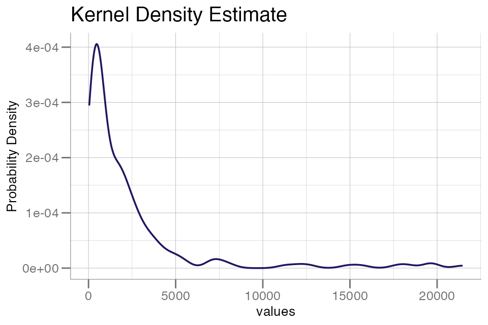
This plot has a fairly long tail, which highlights a common feature
of SomaScan data in RFU space. As a consequence, we typically advise to
plot (and analyze) RFU data in log10() space:
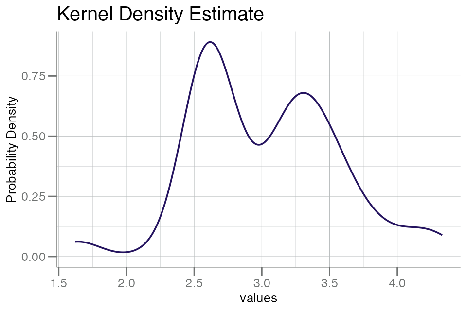
The above plot displays a characteristic bimodal distribution,
suggesting that some underlying structure may be present.
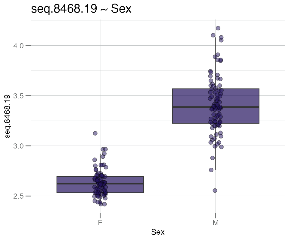
plotPDFbyGroup() creates a PDF plot split by a grouping
variable of (usually) metadata, e.g. Sex. This function
differs from plotPDF() in that it requires a data frame as
input.
For the plot below, the variable Sex will be used to
stratify the groups:
# Clean up data by removing missing 'Sex' values
# and log10() transform
df_sex <- filter(data, !is.na(Sex)) |> log10()

# Generate PDF plot for analyte of interest
plotPDFbyGroup(df_sex, apt = "seq.8468.19", group.var = Sex)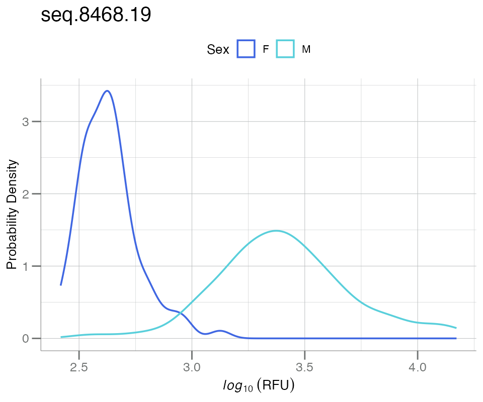
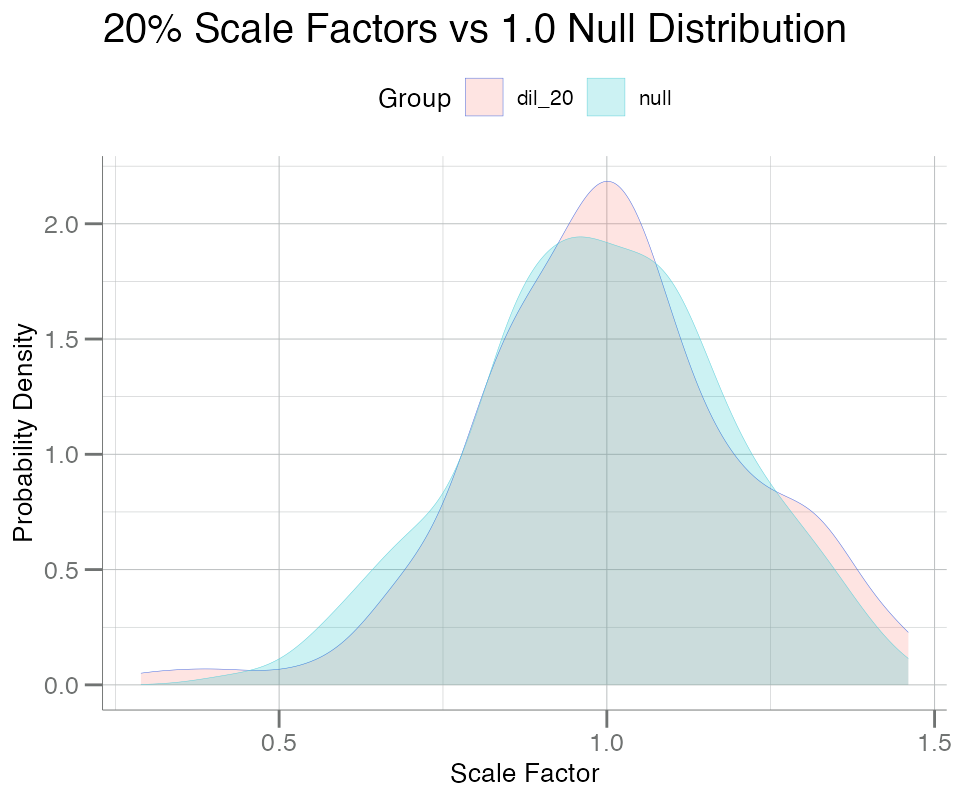
Using plotPDFlist(), a PDF plot can be generated from
any arbitrary named list of numeric vectors, with one smoothed
kernel density curve per list element:
list_seq <- list(
  dil_20 = data$NormScale_20,
  null   = withr::with_seed(101, rnorm(nrow(data), mean = 1, sd = 0.2))
)

plotPDFlist(
  .data = list_seq,
  fill  = TRUE,
  main  = "20% Scale Factors vs 1.0 Null Distribution",
  x.lab = "Scale Factor"
)
CDF Plots
Similarly, CDF plots can be created with a suite of functions that
serve as counterparts to the PDF plotting functions displayed above:
plotCDF(), plotCDFbyGroup(), and
plotCDFlist(). These functions are implemented like the PDF
plotting functions, and use the same type of inputs:
plotCDF(data$seq.8468.19)

plotCDFbyGroup(df_sex, apt = "seq.8468.19", group.var = Sex)

plotCDFlist(list_seq)
Concordance Plots
Plots illustrating the concordance between two continuous variables
(e.g. RFU values from SomaScan analytes) can be generated with
plotConcord().
These plots accept two numeric vectors as input; one for
x, and one for y:
x <- df_sex$seq.3045.72
y <- withr::with_seed(1, x + rnorm(length(x), sd = 0.1))  # add gaussian noise
plotConcord(x, y)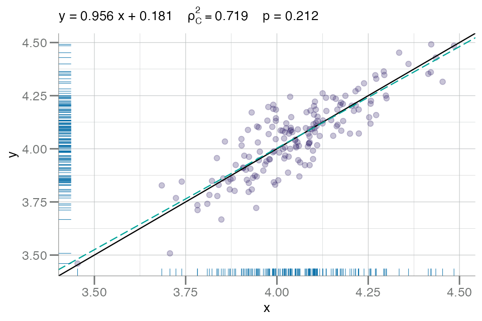
However, plotConcord() will also accept a 2-column data
frame, like so:
df_2col <- data.frame(x = x, y = y)
plotConcord(df_2col)
Volcano Plots
Volcano plots comparing p-value vs. fold-change can be generated
using plotVolcano(). plotVolcano() requires a
2-column data frame of fold-change values and p-values as input. These
data types are not available in our example ADAT, so they will each be
simulated below:
fc_df <- withr::with_seed(101, {
  fc1 <- sort(runif(500, -2.5, 0))   # Z-scores as fc
  fc2 <- sort(runif(500, 0, 2.5))    # Z-scores as fc
  p1  <- pnorm(fc1)
  p2  <- pnorm(fc2, lower.tail = FALSE)
  p   <- jitter(c(p1, p2), amount = 0.1)
  p[p < 0] <- runif(sum(p < 0), 1e-05, 1e-02)   # floor p < 0 after jitter
  data.frame(fc = c(fc1, fc2), p = p)
})
This data frame can now be used as input into
plotVolcano():
# lower p-value cutoff than default
plotVolcano(fc_df, fc, p, cutoff = 0.1)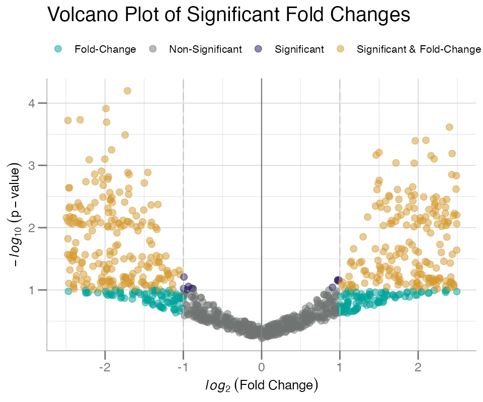
The labels= and identify= arguments can be
used to label the points:
target_map <- getTargetNames(getAnalyteInfo(data))
target_map
#> ══ AptName-Target Lookup Map ══════════════════════════════════════════
#> # A tibble: 5,284 × 2
#>    AptName       Target
#>    <chr>         <chr>
#>  1 seq.10000.28  Beta-crystallin B2
#>  2 seq.10001.7   RAF proto-oncogene serine/threonine-protein kinase
#>  3 seq.10003.15  Zinc finger protein 41
#>  4 seq.10006.25  ETS domain-containing protein Elk-1
#>  5 seq.10008.43  Guanylyl cyclase-activating protein 1
#>  6 seq.10011.65  Inositol polyphosphate 5-phosphatase OCRL-1
#>  7 seq.10012.5   SAM pointed domain-containing Ets transcription factor
#>  8 seq.10013.34  Fc_MOUSE
#>  9 seq.10014.31  Zinc finger protein SNAI2
#> 10 seq.10015.119 Voltage-gated potassium channel subunit beta-2
#> # ℹ 5,274 more rows
#> ═══════════════════════════════════════════════════════════════════════

# add random SeqId rownames to `fc_df`
fc_df <- set_rn(fc_df, withr::with_seed(1, sample(getAnalytes(data), nrow(fc_df))))

# map rownames to target labels
fc_df$target_names <- unlist(target_map, use.names = TRUE)[rownames(fc_df)]

plotVolcano(
  fc_df,
  fc,
  p,
  cutoff   = 0.005,
  labels   = target_names,   # add target labels to points
  identify = TRUE
)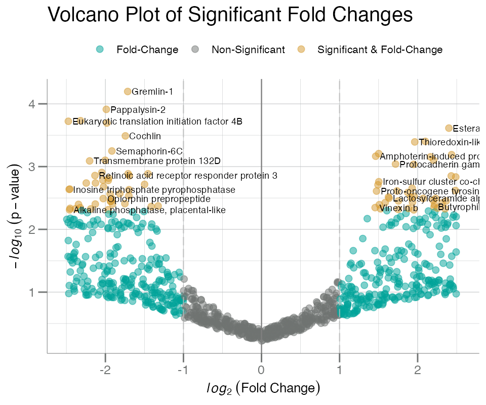
With large significance (i.e. higher cutoff), labels can quickly
become cluttered, overlapping, and difficult to distinguish. To aid with
this an interactive HTML-based volcano plot can be created to explore
individuals point via plotVolcanoHTML(). This function uses
the same input parameters as plotVolcano(), but uses plotly under the hood to generate a
hovering menu that can be used to interactively investigate each
point:
plotVolcanoHTML(
  fc_df,
  fc,
  p,
  cutoff = 0.1,
  labels = target_names
)
Boxplots
The boxplotGrouped() function can be used to plot a
response variable (y) split by the specified grouping
variable(s); up to 2 may be used.
Below, boxplots are generated for a single grouping variable,
Sex.
boxplotGrouped(
  .data     = df_sex,         # log10-transformed soma_adat
  y         = "seq.8468.19",  # PSA target
  group.var = "Sex",          # grouping variable
  beeswarm  = TRUE            # add beeswarm points
)
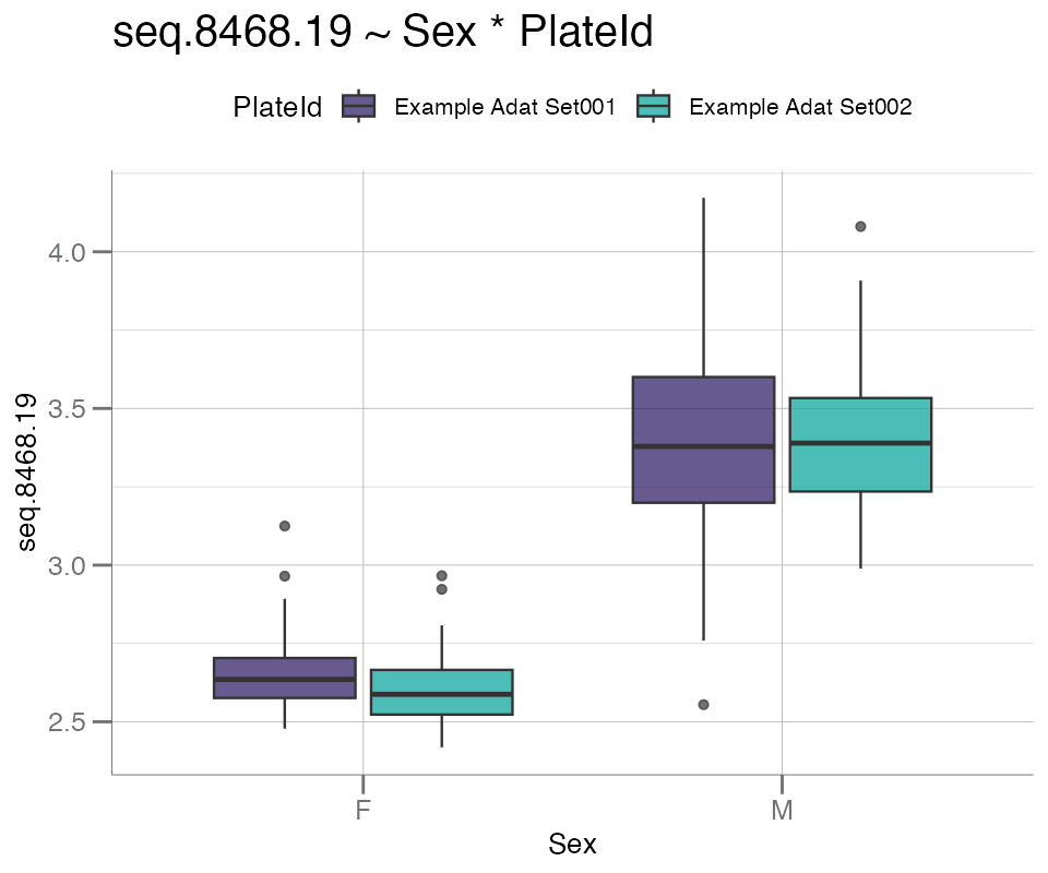
One additional grouping variable can be added, if desired. For
example, PlateId is used as the second variable to split
the data by both Plate and Sex to investigate
possible plate bias by gender:
boxplotGrouped(
  .data     = df_sex,
  y         = "seq.8468.19",        # PSA target
  group.var = c("Sex", "PlateId")   # 2 splitting variables
)
Boxplots with “beeswarm”-style points can be created with
boxplotBeeswarm(). Note that the boxes in the plot below
correspond to columns of the data frame, not groups within a
categorical metadata variable (as seen in
boxplotGrouped()).
boxplotBeeswarm(
  data.frame(seq.10056.5 = data$seq.10056.5,
             seq.10021.1 = data$seq.10021.1) |> log10()
)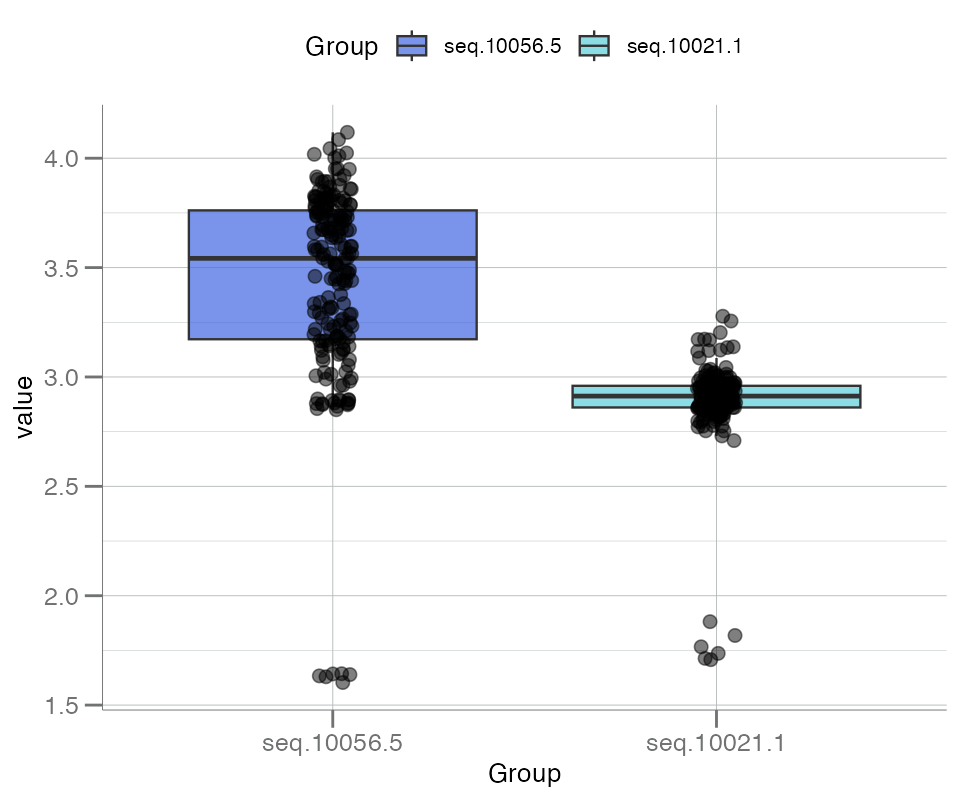
Notice the small group of low-signaling values that can be seen by adding “beeswarm” points. These represent buffer control samples and will be investigated further below.
Lastly, boxplotSubarray() can be used to visualize the
distribution of all analytes, stratified by subarray, each as its own
boxplot. In the SomaScan context, a subarray refers to an
individual sample or row of data.
samples <- withr::with_seed(123, sample(rownames(data), 20L))
df_subarray <- data[samples, ]
boxplotSubarray(df_subarray, color.by = "SampleType")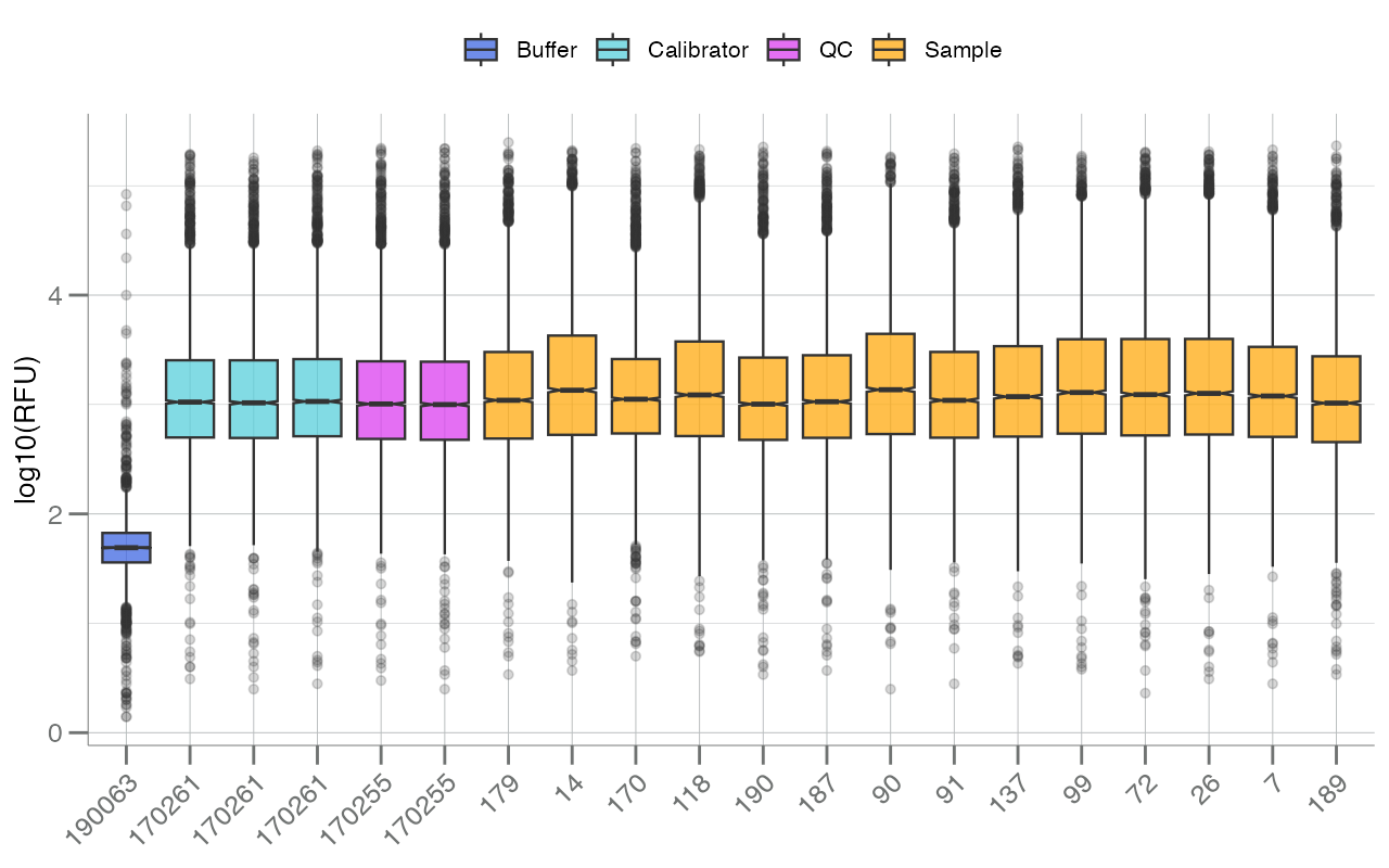
In the figure above, each boxplot represents a single
sample/subarray/row (the x-axis is labeled by SampleId),
and boxes are colored by sample type (via SampleType). RFU
values (log10-transformed by default) for all available
analytes are plotted for each sample.
In addition to the color.by= argument, the
apts= argument can be passed to highlight specific analytes
within each subarray.
seqs <- c("seq.8468.19", "seq.3045.72")
boxplotSubarray(df_subarray, color.by = "SampleType", apts = seqs)
Histograms
SomaPlotr provides one histogram plotting function,
plotDoubleHist(), that allows the distribution of two
numeric vectors to be overlaid for easy visual comparison:
withr::with_seed(123,
  data.frame(
    seq.1234.56 = rnorm(1000, 2, 0.3),
    seq.9876.54 = rnorm(1000, 3, 0.3)
  )
) |> plotDoubleHist()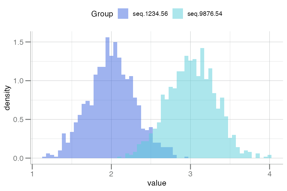
Longitudinal Data
Change in subjects across time can be tracked using
plotLongitudinal(). As the name suggests, this function is
designed to track RFU measurements in sample groups over time.
plotLongitudinal() requires input data of a different
format than previously described plots. Instead, a measurement must be
present for each sample type and subject at each time point. To satisfy
this requirement, additional data will need to be simulated and added to
the example data set we have been using. This will better emulate the
type of longitudinal study data that plotLongitudinal() is
designed to visualize.
df_long <- withr::with_seed(123, {
  samples <- sample(df_sex$SampleId, 6L) # Select a subset of samples for the fake study
  data.frame(
    SampleId    = rep(samples, each = 3L),
    TimePoint   = rep(c("0 baseline", "12 mo", "24 mo"), 6L), # Add timepoint measurements
    TissueType  = rep(c("Whole blood", "Plasma", "White blood cells"), each = 3L), # Specify tissue collection
    seq.10021.1 = sample(df_sex$seq.10021.1, 18L) # Sample RFU measurements for analyte of interest
  )
})
head(df_long, 10L)
#>    SampleId  TimePoint        TissueType seq.10021.1
#> 1       179 0 baseline       Whole blood    2.919130
#> 2       179      12 mo       Whole blood    2.798582
#> 3       179      24 mo       Whole blood    2.949683
#> 4        17 0 baseline            Plasma    2.891983
#> 5        17      12 mo            Plasma    2.860877
#> 6        17      24 mo            Plasma    3.019532
#> 7        57 0 baseline White blood cells    2.959518
#> 8        57      12 mo White blood cells    3.123133
#> 9        57      24 mo White blood cells    2.974143
#> 10      132 0 baseline       Whole blood    2.935054
The longitudinal plot can now be generated:
plotLongitudinal(
  data     =  df_long,
  y        = "seq.10021.1",
  time     = "TimePoint",
  id       = "SampleId",
  color.by = "TissueType",
  summary.line = NULL   # suppress summary lines
)
#> New names:
#> • `` -> `...5`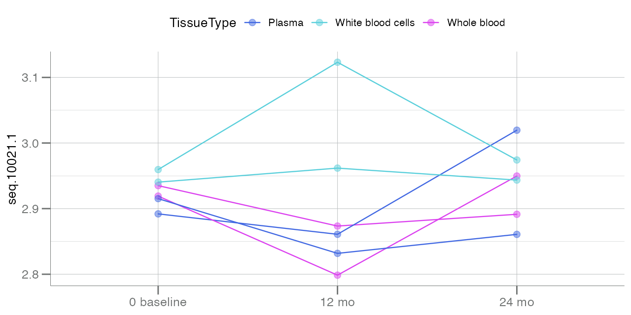
Lines stemming from each point at baseline signify the
change in analyte seq.10021.1 over time, based on the
tissue type of the collected sample.
Color Palettes
For examples of all plotting themes and palettes available in this
package, see the themes vignette
(vignette("themes-and-palettes")).