Chapter 5 Plots
ProViz provides tools to dynamically create a variety of plots with custom options. Plots can be created using SomaScan® Assay data as well as meta data in the ADAT or data imported in the Merge Data panel. Plot features such as titles, colors, and lines can be added and customized using selectable options in the ProViz plotting panels.
5.1 Plot Features
At any point during plotting, moving the mouse over the plot will show a toolbar at the top of the plot.

Plot toolbar
The icons from left to right provide the following features.
- download as PNG - saves the image to a file
- zoom - when selected, the plot can be zoomed by clicking and dragging the mouse
- pan - when selected, the plot can be moved by clicking a dragging
- zoom in - zooms into the plot, keeping the current center
- zoom out - zooms into the plot, keping the current center
- autoscale - resets the coordinates of the plot if it has been zoomed or panned (similar to reset axes, below)
- reset axes - resets coordinates of the plot if it has been zoomed or panned (similar to autoscale, above)
- toggle spike lines - when selected, hovering over points on the graph will also include lines from the point to the axes
- show closest data on hover - only information about the closest data point will be shown when the point is hovered over
- compare data on hover - if multiple points are plotted at the same location, data for all points will be shown
- Plotly icon - a link to the Plotly website. Plotly is the tool used by ProViz to produce graphs.
5.2 Dynamic Plot Interactions
At any point during plotting, the plots provide dynamic interaction capabilities. Hovering on the plotted elements themselves, such as boxes in a box plot or points in any plot, provides additional information about the samples corresponding to that plotting element. Plots can be zoomed or panned by clicking and dragging - see the details above in Plot Features.
5.3 Boxplots
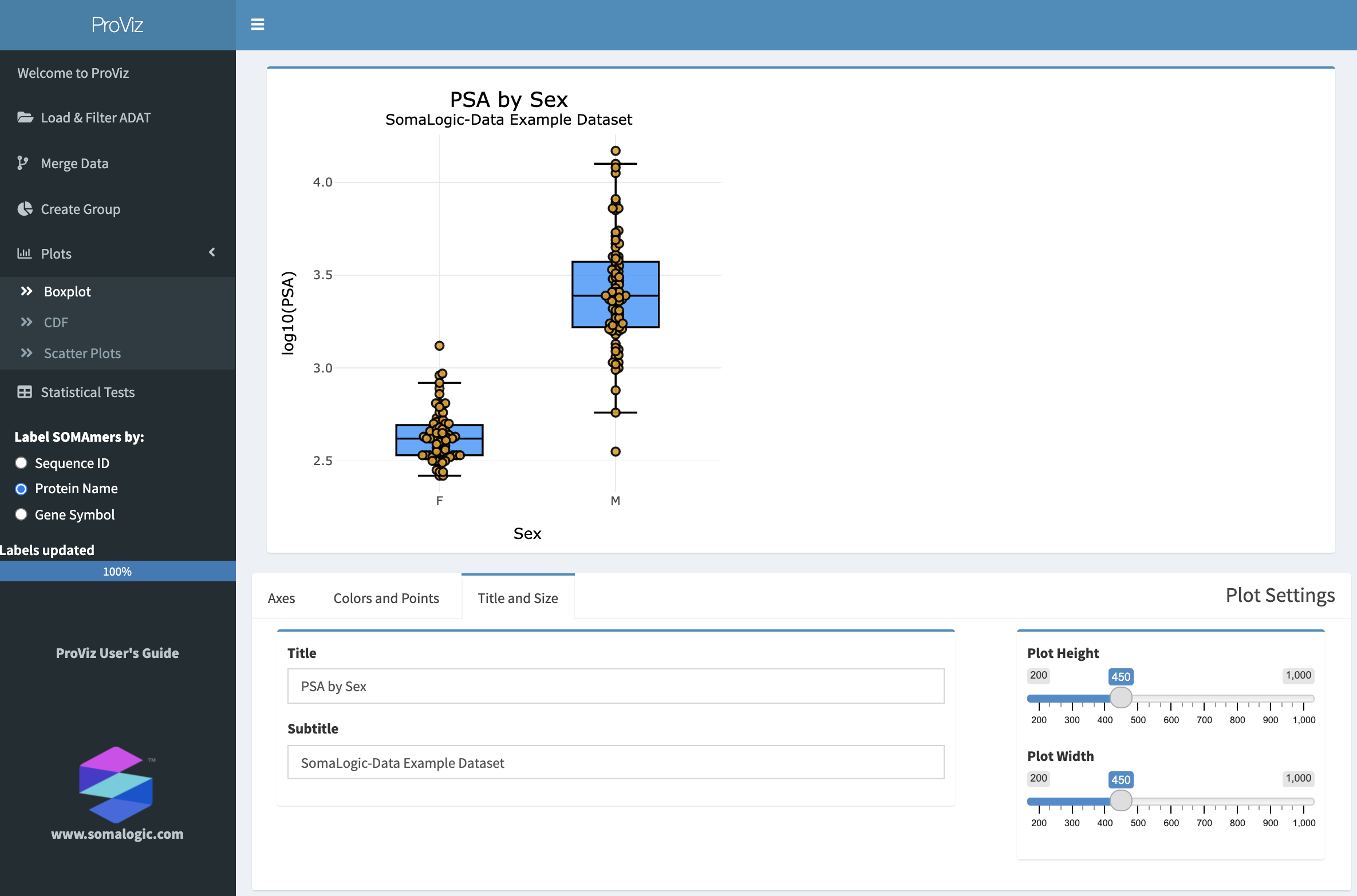
The Boxplot panel with a customized plot.
5.3.1 Axes
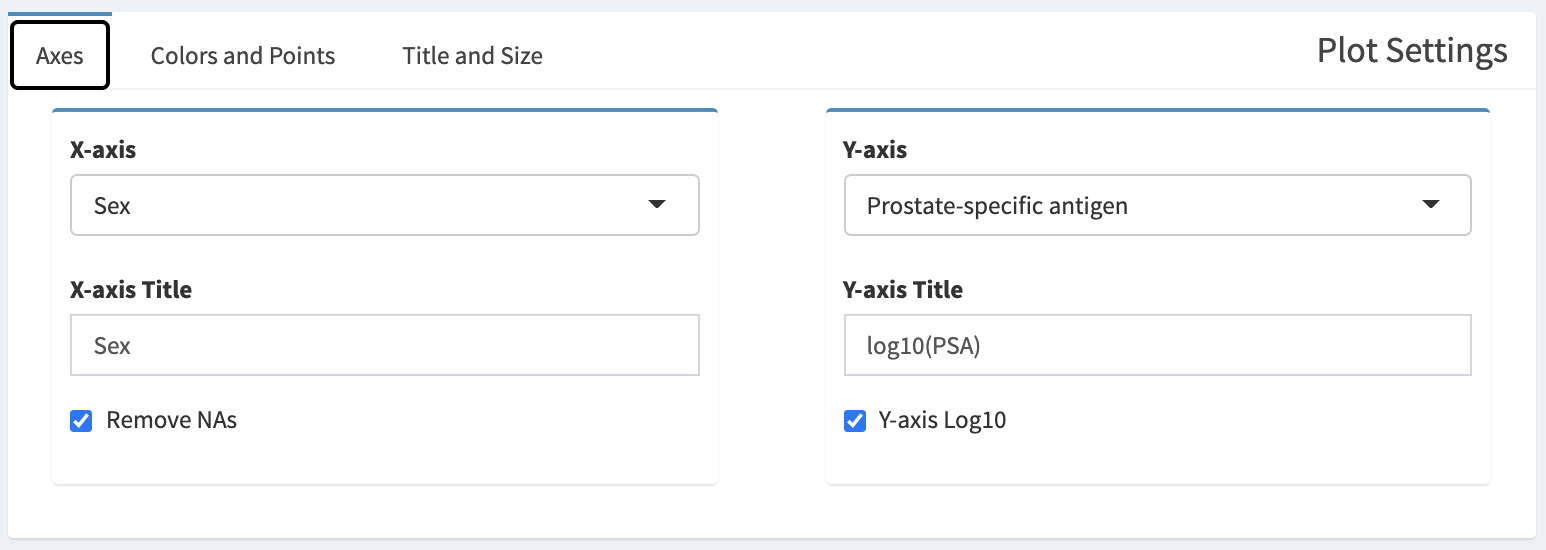
The Axes tab in the Plot Settings box.
A categorical variable that defines the boxes in the boxplot can be selected from the X-axis select box. If the categorical variable has missing values (NAs), those can be removed by selected Remove NAs.
A continuous variable can be selected from the Y-axis select box. The continuous variable can be transformed by log10 by selecting Y-axis Log10.
5.3.2 Colors and Points
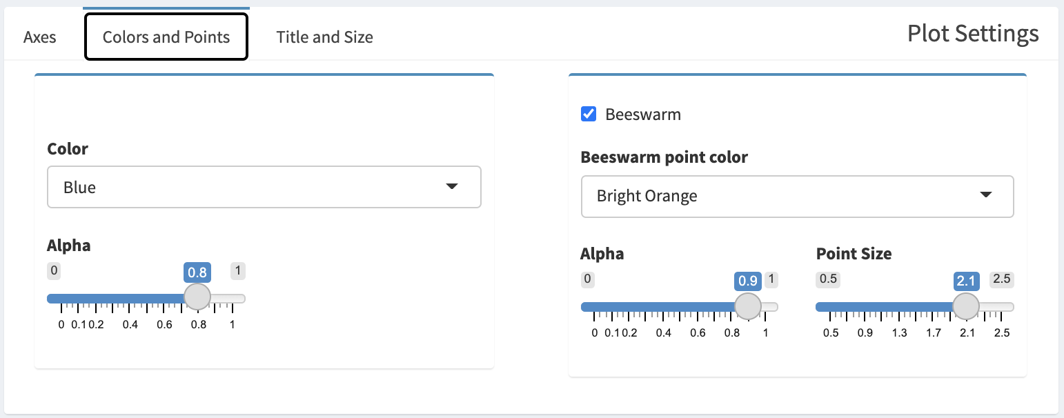
The Colors and Points tabs in the Plot Settings box.
Colors of boxes can be customized by selecting from the Color select box, and the degree of transparency can be adjusted with the Alpha slider on the left.
Individual points for each sample can be displayed by selected Beeswarm. Colors of the points can be customized by selecting a color from Beeswarm point color and the transparency can be adjusted with the Alpha slider on the right. The size of the points can be adjusted with the Point Size slider.
5.3.3 Title and Size
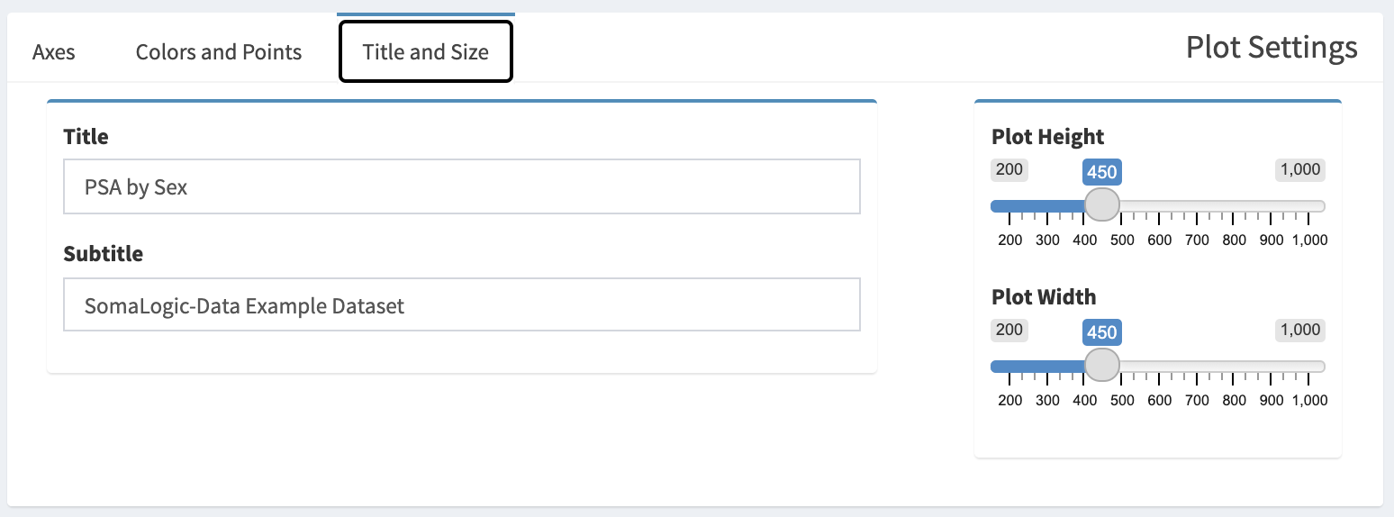
The Title and Size tab in the Plot Settings box.
A title and subtitle can be added to the plot by entering text into the Title and Subtitle boxes. The plot size can be adjusted using the Plot Height and Plot Width sliders.
5.4 CDF Plots
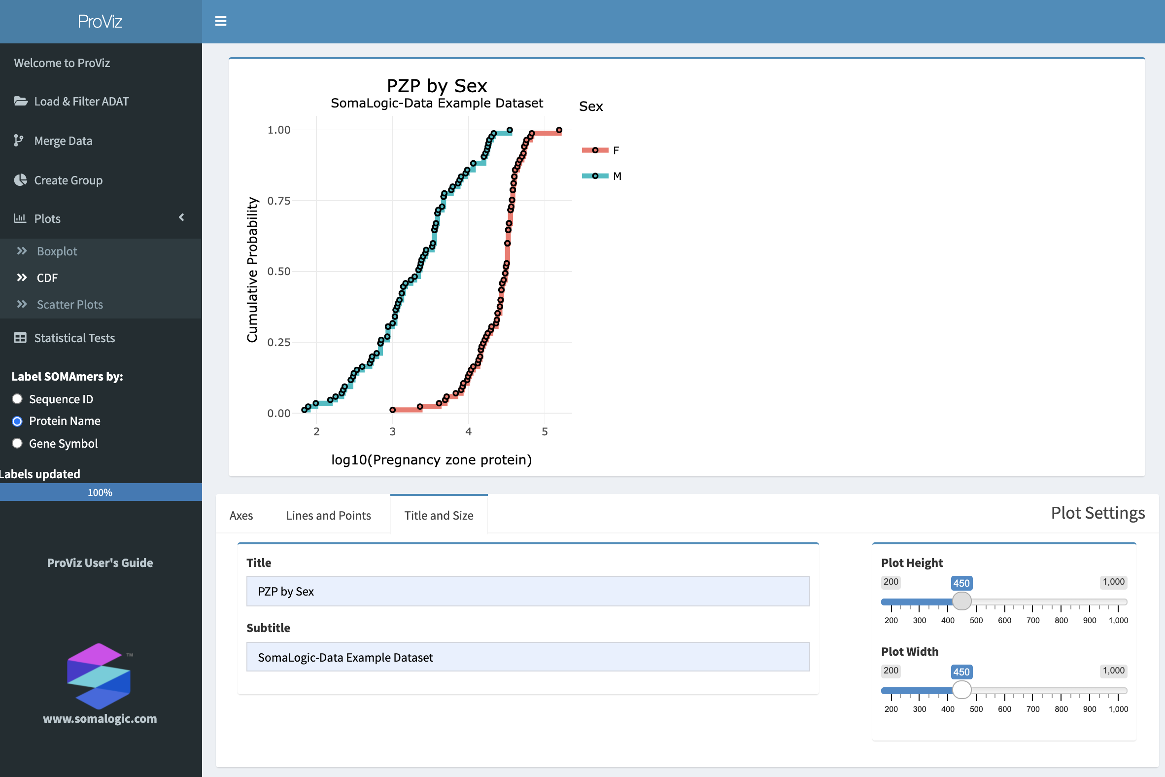
The CDF panel with a customized plot.
5.4.1 Axes
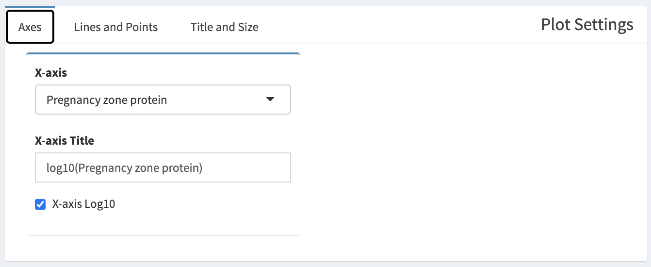
The Axes tab in the Plot Settings box.
A continuous variable can be selected from the X-axis select box. The continuous variable can be log10 transformed by selecting X-axis Log10.
5.4.2 Lines and Points
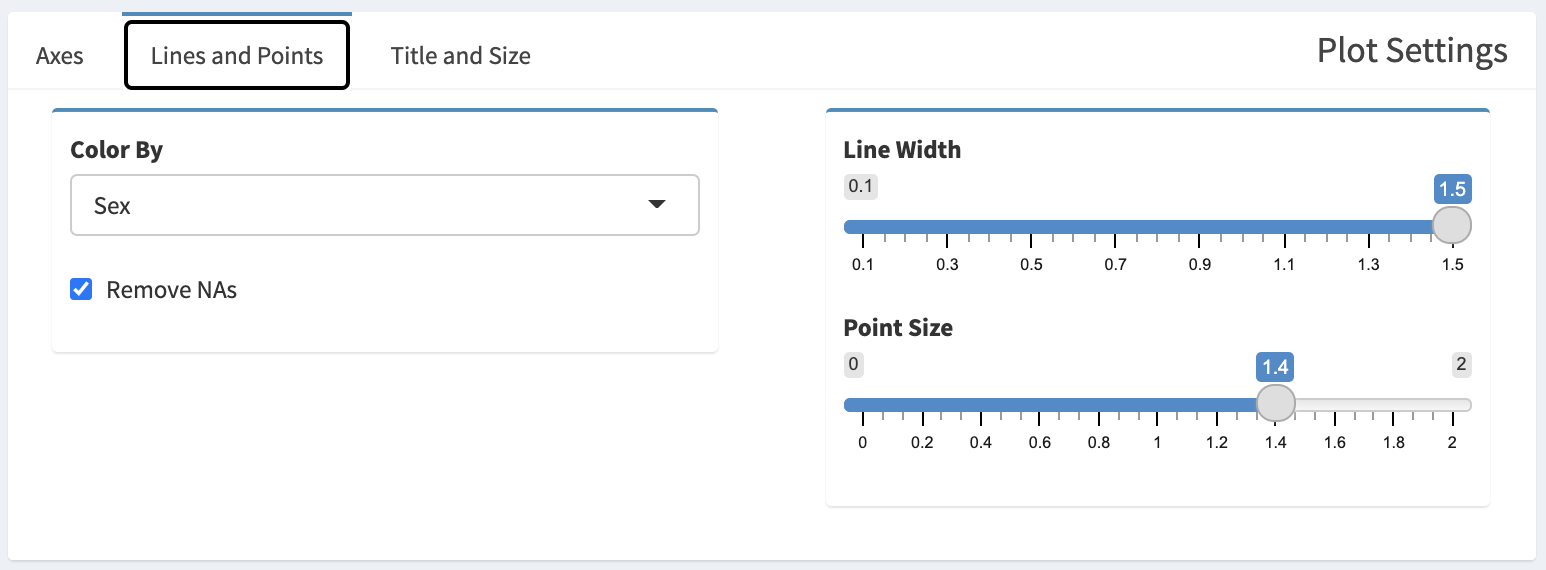
The Lines and Points tab in the Plot Settings box.
A categorical variable can be selected from the Color By select box, which will produce one CDF for each category in that variable. If there are NAs for some samples, a CDF will also be produced for NA-containing set, or it can be removed by selecting Remove NAs. Line width can be adjusted using the Line Width slider, and point sizes can be adjusted with the Point Size slider. If the Point Size slider is set to 0, points will be removed from the plot.
5.4.3 Title and Size
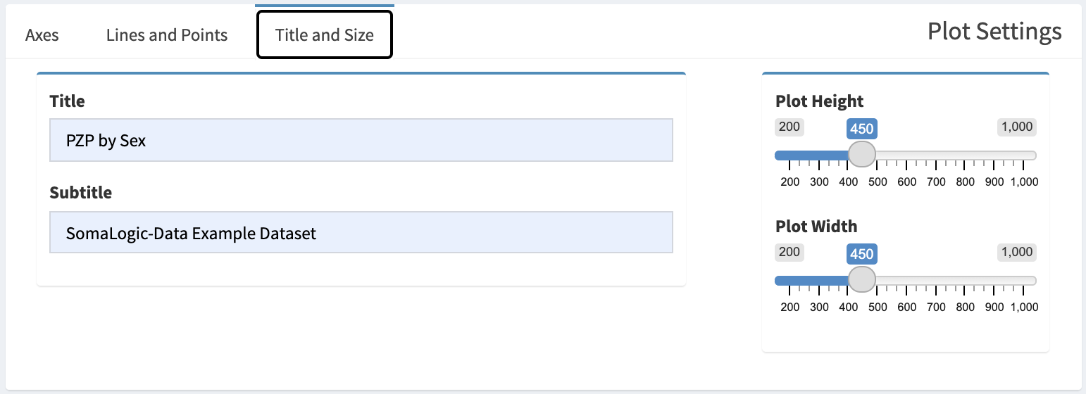
The Title and Size tab in the Plot Settings box.
A title and subtitle can be added to the plot by entering text into the Title and Subtitle boxes. The plot size can be adjusted using the Plot Height and Plot Width sliders.
5.5 Scatter Plots
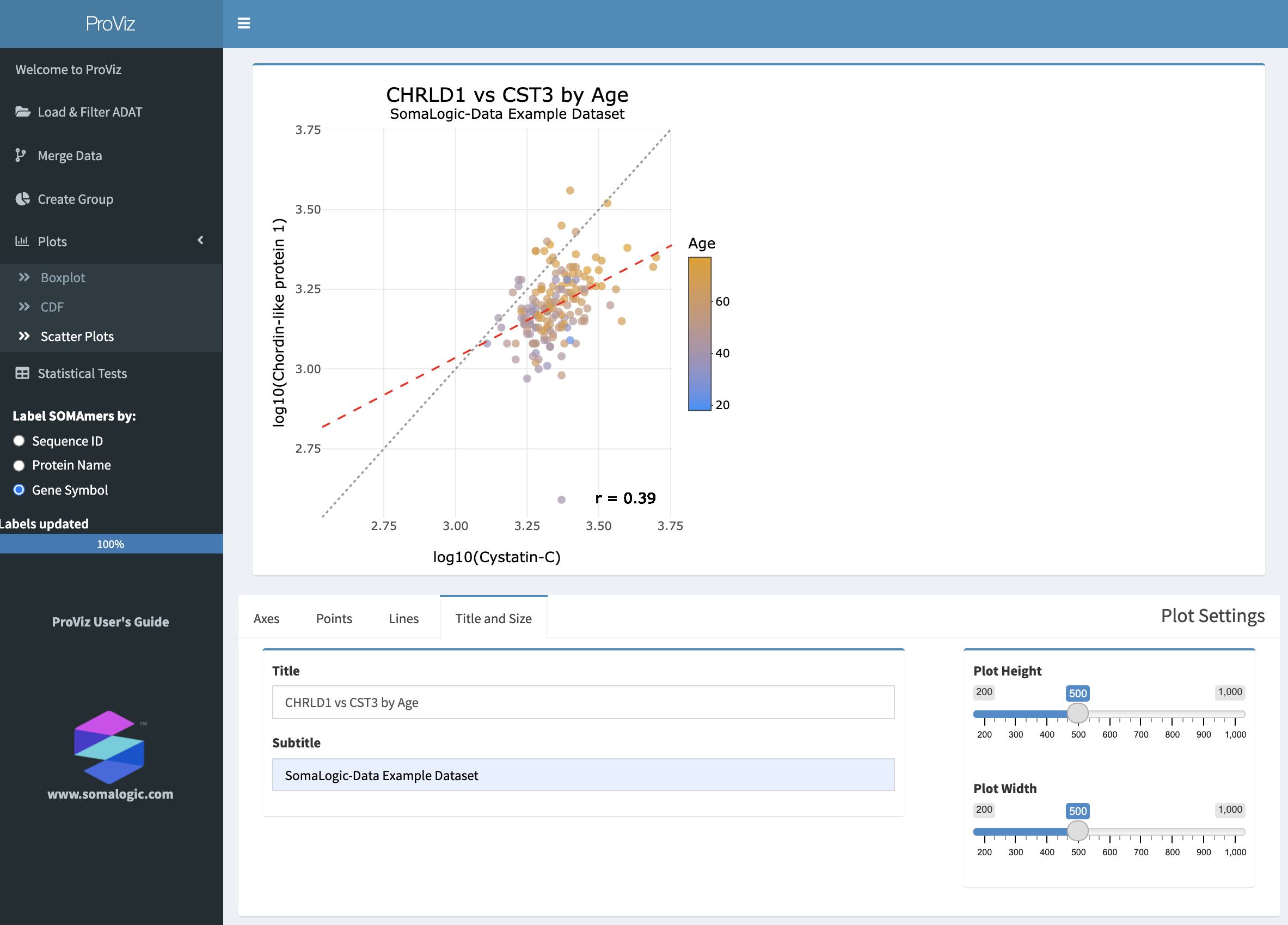
The Scatter Plot panel with a customized plot.
5.5.1 Axes
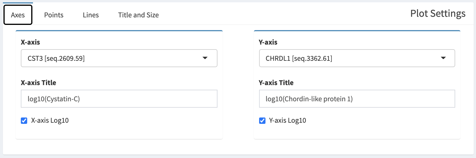
The Axes tab in the Plot Settings box.
To set the X- and Y-axes, select continuous variables from the X-axis and Y-axis select boxes. Selecting X-axis Log10 or Y-axis Log10 will log10 transform the data for that axis.
5.5.2 Points
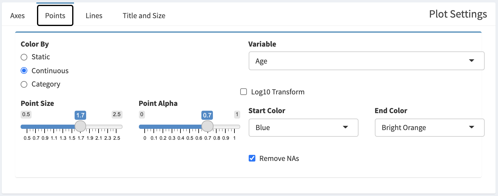
The Points tab in the Plot Settings box.
Individual points can be colored in multiple ways depending on the selection for Color By.
If Static is selected, all points will be the same color, and that color can be chosen from the Point Color select box.
If Continuous is selected, points can be colored by a gradient across two colors based upon the value of a chosen variable. Chose the variable using the Variable select box. The values for the variable can be log10 transformed by selecting Log10 Transform. The colors to use for the gradient can be chosen by selecting colors from Start Color and End Color.
If Category is selected, points can be colored based upon a categorical variable. The variable can be chosen from the Variable select box.
Points can also be sized by adjusting the Point Size slider, and their transparency adjusted using the Point Alpha slider. If there are NAs present, they can be removed by selecting Remove NAs.
5.5.3 Lines
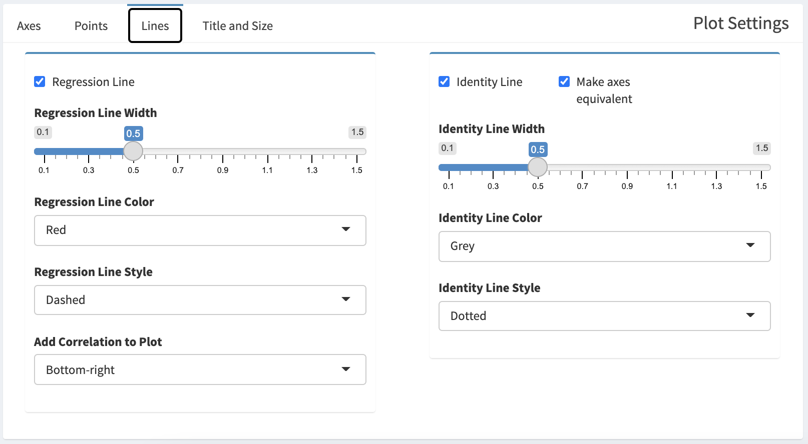
The Lines tab in the Plot Settings box.
A linear regression line can be added to the plot by selecting Regression Line. The width of the line can be adjusted with the Regression Line Width slider, it can be colored by selecting a color from Regression Line Color, and the plotting style (solid, dashed, dotted, etc.) can be selected from the Regression Line Style select box. The correlation can be added to the plot by selecting an position option from the Add Correlation to Plot select box.
An identity line can be added to the plot by selecting Identity Line. Identity lines are useful to illustrate the expected, perfect one-to-one relationship between two variables, known as the the concordance. Selecting Make axes equivalent will create a square plot in which the extents of the X- and Y-axes are the same. The width of the identity line can be adjusted with the Identity Line Width slider, the color can be selected from the Identity Line Color select box, and the plotting style selected from the Identity Line Style select box.
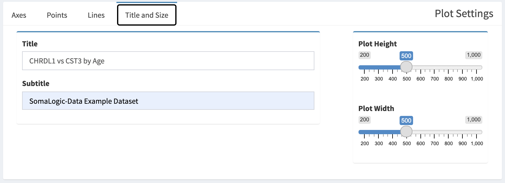
5.5.4 Title and Size
The Title and Size tab int he Plot Settings box.
A title and subtitle can be added to the plot by entering text into the Title and Subtitle boxes. The plot size can be adjusted using the Plot Height and Plot Width sliders.